Welcome to our kitchen remodel reveal! For those who have been following along on Instagram, you may know that this renovation started in June due to contractor availability and long wait times for materials. I made the design plan in January and met with contractors then. I posted progress photos in June and in July. We just received our range last week (Ordered in February. It’s an Ilve range and it’s just beautiful!). So I can finally post the photos here on the blog!
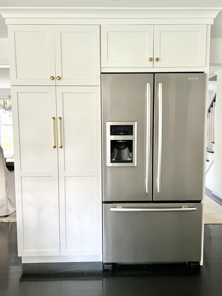
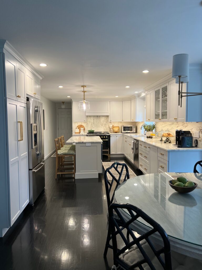
Before the renovation the kitchen felt small and dark despite it being a decent length, and each workspace was tight. We were able to increase the size of each workspace by rearranging the layout while basically keeping the same square footage (about 6” was added to the old wall oven wall and about 4” to the old pantry wall). We gained the full space of the island and another set of cabinets where the old wall oven was by removing the cooktop and wall oven/ microwave and getting a full range stove. With the new larger stove in its new location, there is more room to cook and to place items on both sides. We got a larger sink, a 32″ fireclay sink vs the old 24″ stainless sink, which makes a huge difference. The new countertop space where the old wall oven/microwave was is life changing! Our pantry is about 2″ narrower than the old one, which is hardly noticeable. We don’t miss that little countertop that was next to the fridge at all, so that change to move the pantry over next to the fridge to make room for the stove was a great move.
While working on the cabinet part of the design, I went through every existing cabinet we had to decide how to better organize everything (it was also a great time to thin out many items!) I decided to go with a lot of drawers and rollouts for better storage and organization. This was tedious planning but well worth it.
Getting rid of the soffits made the ceiling higher. We had a full overhaul of lighting done including adding recessed lights to the entire space rather than the one side, adding a second island pendant and adding under cabinet lighting.
We switched from an electric cooktop to gas range and added a custom hood that blended well with the cabinet style.
Obviously the cosmetic changes are a more simple cabinet style, a lighter colored countertop and backsplash in marble and brass hardware. I just love the patina of unlacquered brass, it adds an immediate warmth and elegance to any space. A mini makeover was done in the breakfast nook as well with this kitchen remodel.
Kitchen
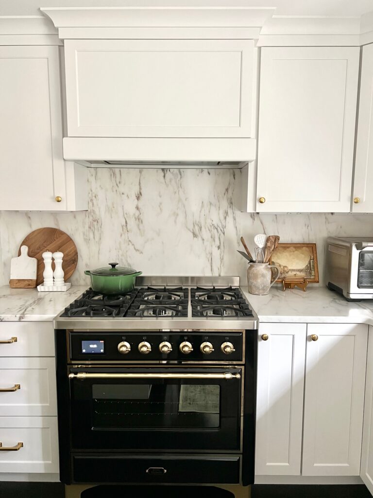
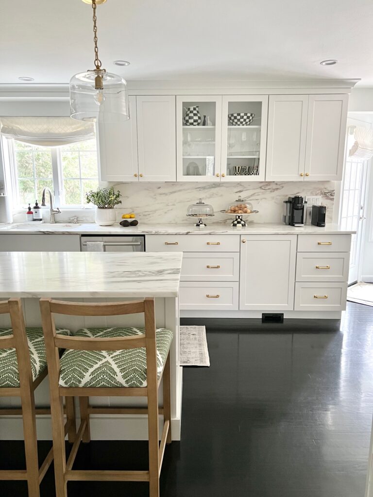
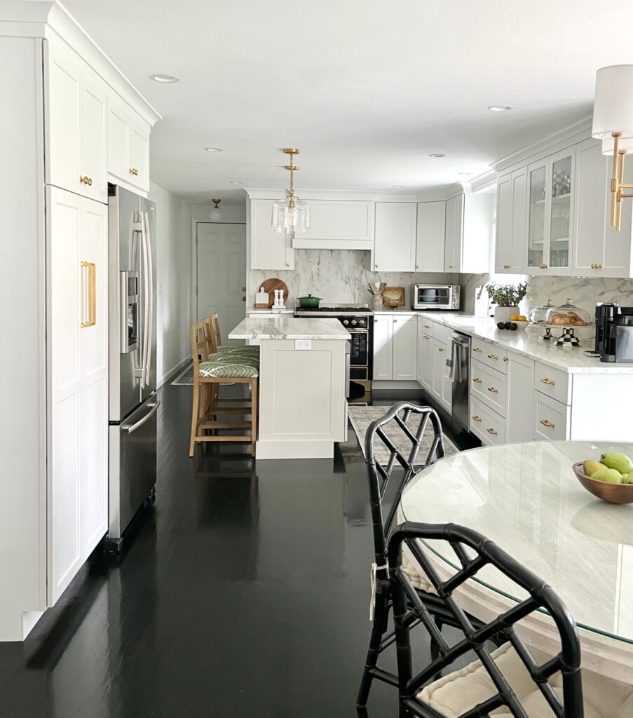
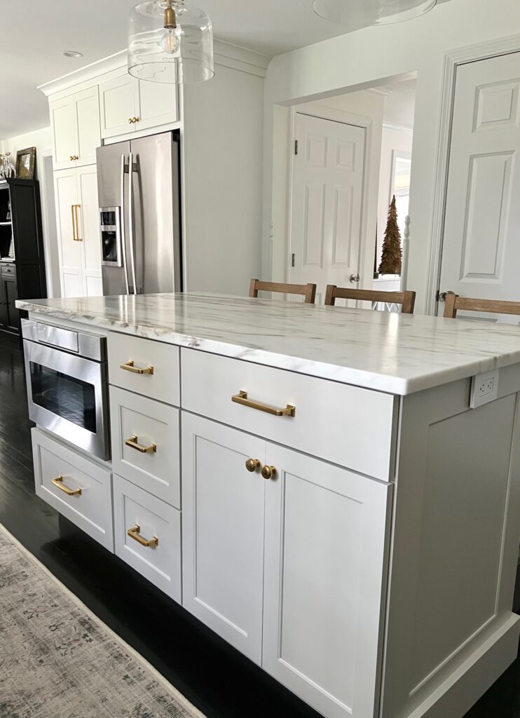
Here are a couple of photos with the lighting: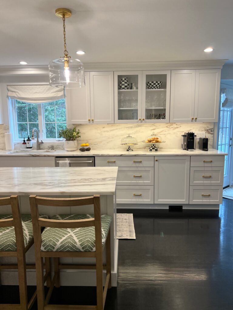
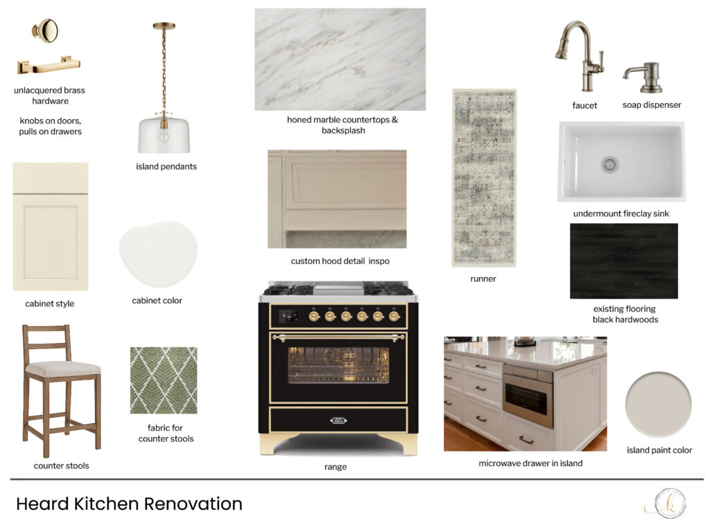
The design plan
Sources
Sink: House of Rohl
Faucet: Brizo
Cabinet hardware: Rejuvenation
Pendant lights: Circa Lighting
Range: Ive
Runner: Ruggable
Builder: Colburn and Grove Custom Construction
Here are some before photos:
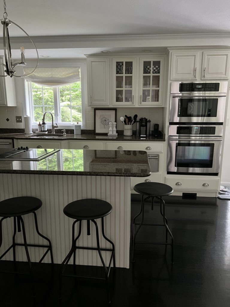
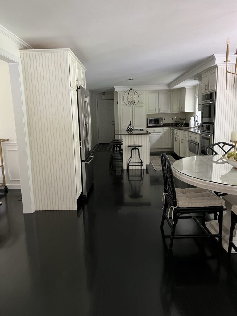
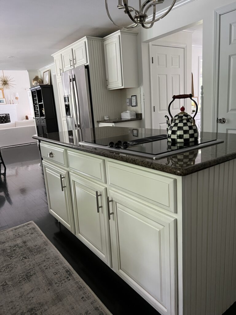
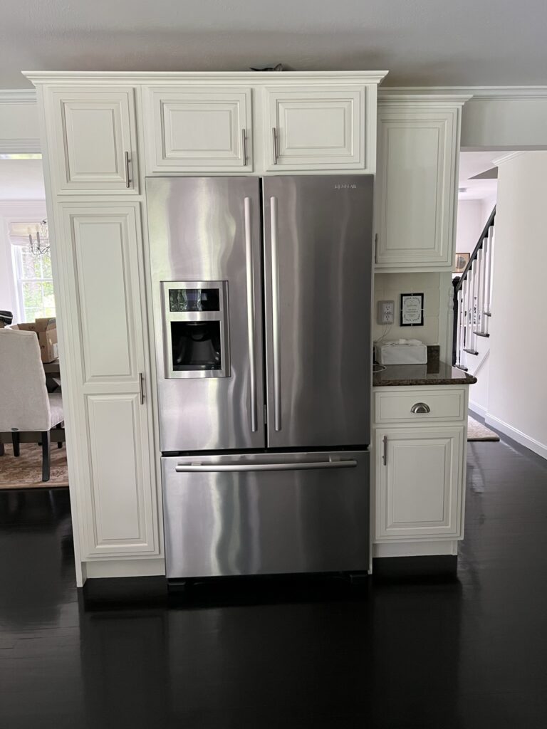
Breakfast Nook
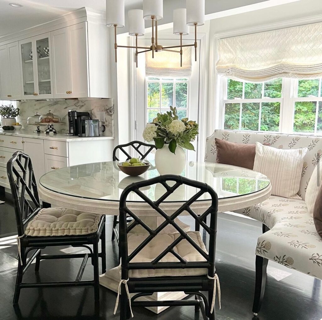
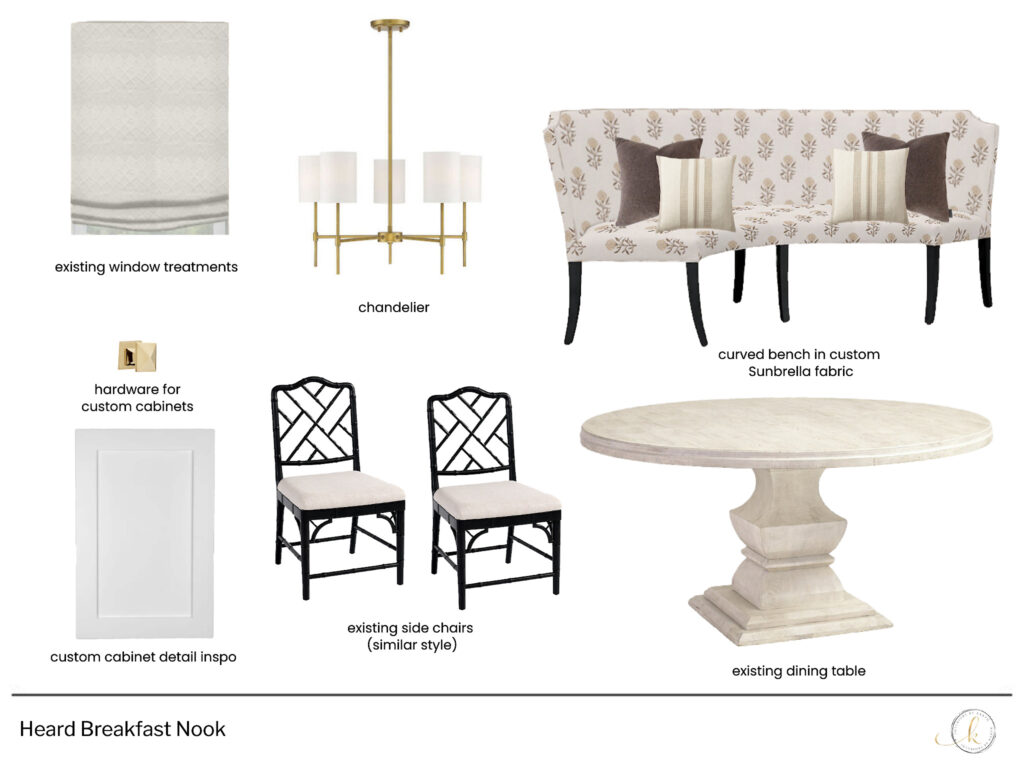
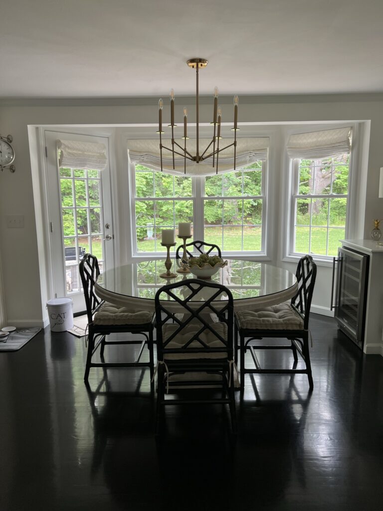
For the breakfast nook, the table is newish and the chairs and window treatments are still beautiful and going strong so not a lot was needed here. We added a curved bench in a stain and fade resistant performance fabric for more seating and a chandelier in a style that works better with the new kitchen.
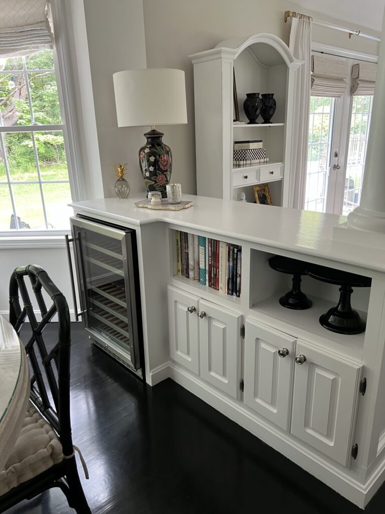
The wine fridge was starting to have issues so we had it removed and had the space replaced with storage shelves. We also had the column removed, a new top installed and doors placed over the previous open shelves to create more well needed hidden storage.
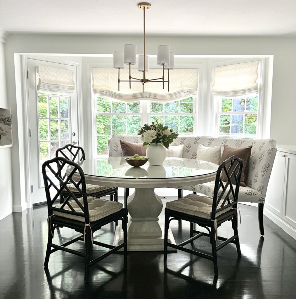
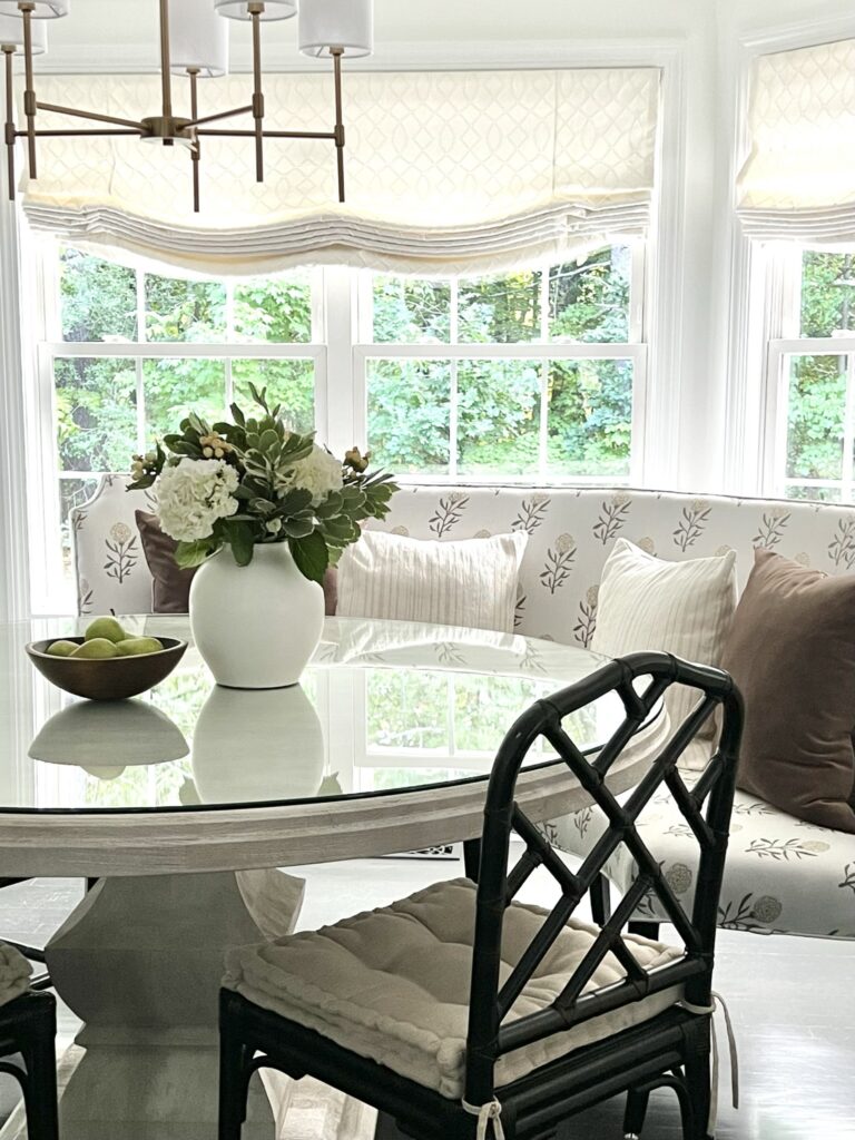
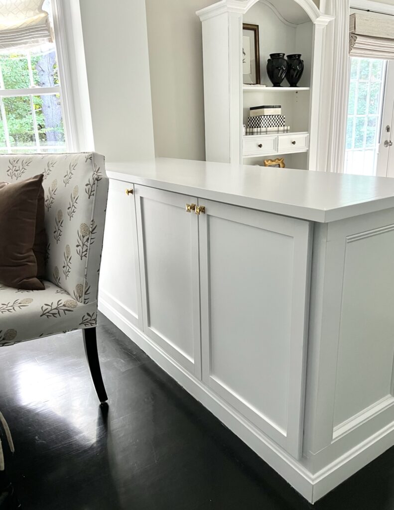
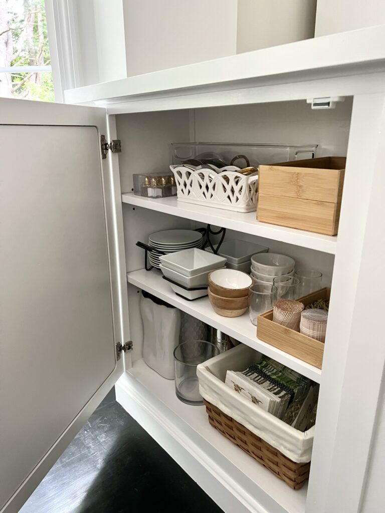
The design plan
Here are some before photos:
We are thrilled with our new space! It feels so much more open and spacious and bright! Preparing food is so much easier with the new counter space from this kitchen remodel. Gas cooking is so much faster than electric and the lighting has helped tremendously with the space and really the whole downstairs since it’s such an open floor plan. Thanks for stopping by!
Contact me if you need help with your space!


It’s so beautiful. You did an amazing job.
Beauty and function 👌🏻
Thank you, Joann!
What a beautiful kitchen! That marble backslash is stunning and the range 😍!
Thanks, Sarah!
I like the look of that new bench in the breakfast nook. It makes the seating area look larger and more inviting and that stove is gorgeous.
Caleb, thank you!